
SF Symbols are Apple’s official library of icons designed for apps, websites, and digital interfaces. In short, SF Symbols help developers and designers create clean, modern, and consistent user experiences across Apple devices.
If you use an iPhone, iPad, Mac, or Apple Watch, you’ve already seen SF Symbols in action every day.
From simple arrows and hearts to advanced weather and accessibility icons, SF Symbols have become one of the most important design tools in the Apple ecosystem.
Whether you are a student, designer, app developer, or curious beginner, understanding SF Symbols can help you create better digital products and understand modern app design more clearly.
What Are SF Symbols?
SF Symbols are a collection of icons created by Apple for use in apps and interfaces built for Apple platforms like:
- iOS
- macOS
- iPadOS
- watchOS
- tvOS
- visionOS
These symbols are designed to work perfectly with Apple’s system font called San Francisco. That is where the “SF” in SF Symbols comes from.
The icons are scalable, customizable, and easy to use. Developers can add them directly into apps using tools like:
- SwiftUI
- UIKit
- Xcode
Designers also use them in apps such as:
- Figma
- Sketch
- Adobe XD
Today, SF Symbols are widely used because they save time and maintain visual consistency across Apple products.
The History of SF Symbols
Before SF Symbols existed, developers often had to create custom icons for every app feature. This process was slow and sometimes resulted in inconsistent designs.
In 2019, Apple introduced SF Symbols during the Apple Worldwide Developers Conference. The goal was simple:
- Give developers a standardized icon library
- Improve app consistency
- Make interfaces easier to understand
At launch, the library included around 1,500 symbols. Over time, Apple expanded the collection dramatically. New versions now contain thousands of icons covering nearly every category imaginable.
This growth reflects how important visual communication has become in modern technology.
Why SF Symbols Matter
SF Symbols are more than decorative icons. They improve usability, accessibility, and user experience.
Consistent Design
One major benefit is consistency. When users see familiar symbols across apps, they immediately understand what actions mean.
For example:
- A magnifying glass means search
- A trash can means delete
- A heart means favorite
- A gear means settings
Because these symbols are standardized, users feel comfortable navigating apps quickly.
Faster Development
Developers save huge amounts of time because they do not need to design every icon from scratch.
Instead of:
- Hiring an illustrator
- Creating custom graphics
- Exporting multiple icon sizes
They can simply use SF Symbols.
Better Accessibility
SF Symbols are optimized for accessibility features like:
- Dynamic Type
- VoiceOver
- High contrast settings
This helps make apps more inclusive for people with visual impairments or disabilities.
Professional Appearance
Apps using SF Symbols often look cleaner and more professional because the icons match Apple’s design language perfectly.
How SF Symbols Work
SF Symbols are vector-based icons. This means they can scale to different sizes without losing quality.
Unlike traditional image files, vector graphics remain sharp and clear.
Symbol Weights
SF Symbols support multiple weights similar to text fonts.
Examples include:
- Ultralight
- Thin
- Regular
- Medium
- Bold
- Heavy
This flexibility allows icons to match surrounding text perfectly.
Symbol Scales
Symbols can also appear in different scales:
- Small
- Medium
- Large
This helps maintain balance in user interfaces.
Rendering Modes
Developers can customize symbols using rendering modes such as:
Monochrome
A single-color icon.
Hierarchical
Uses multiple opacity levels for depth.
Palette
Supports multiple colors in one icon.
Multicolor
Displays rich predefined colors automatically.
These options allow designers to create modern and dynamic interfaces.
Popular Categories of SF Symbols
Apple organizes SF Symbols into many categories.
Communication Symbols
These include:
- Message icons
- Phone icons
- Video call symbols
- Email symbols
Examples:
- bubble.left
- phone.fill
- envelope
Weather Symbols
Weather icons are especially popular.
Examples:
- cloud.sun
- snowflake
- tornado
- moon.stars
These symbols appear in weather apps and widgets.
Media Symbols
Used in music and video apps.
Examples:
- play.fill
- pause.fill
- backward.fill
- forward.fill
Health and Fitness Symbols
Common in health apps and smartwatches.
Examples:
- heart.fill
- figure.walk
- figure.run
- lungs.fill
Navigation Symbols
Helpful for maps and travel apps.
Examples:
- location.fill
- map
- compass
- car.fill
SF Symbols in Everyday Life
Many people use SF Symbols daily without realizing it.
Here are some common examples.
iPhone Settings App
The Settings app contains dozens of SF Symbols:
- Wi-Fi icon
- Bluetooth icon
- Battery icon
- Privacy icon
These symbols help users instantly identify features.
Apple Music
Playback controls use recognizable SF Symbols:
- Play
- Pause
- Shuffle
- Repeat
Apple Maps
Navigation icons simplify directions and travel information.
Smartwatches
On the Apple Watch, SF Symbols display:
- Workout tracking
- Heart rate
- Notifications
- Weather conditions
Because watch screens are small, clear symbols are essential.
How Developers Use SF Symbols
Developers can easily integrate SF Symbols into apps.
Using SwiftUI
SwiftUI makes adding symbols very simple.
Example:
Image(systemName: “heart.fill”)
This single line displays a heart icon.
Using UIKit
UIKit also supports SF Symbols.
Example:
UIImage(systemName: “star.fill”)
Customization
Developers can:
- Change colors
- Resize icons
- Add animations
- Combine symbols
This flexibility makes SF Symbols powerful for modern app design.
SF Symbols for Designers
Designers love SF Symbols because they simplify interface creation.
Faster Prototyping
Instead of drawing icons manually, designers can drag SF Symbols directly into mockups.
This speeds up:
- Wireframes
- User interface designs
- App prototypes
Better User Experience
Using familiar symbols reduces confusion.
Users learn apps faster because the icons already feel recognizable.
Cross-Platform Harmony
Designers can create interfaces that look consistent across:
- iPhone
- iPad
- Mac
- Apple Watch
This consistency strengthens brand trust.
Accessibility and Inclusivity
One of the most impressive aspects of SF Symbols is accessibility support.
Dynamic Type Compatibility
Icons automatically adjust with text sizes.
If a user increases font size for readability, symbols scale appropriately too.
VoiceOver Support
Screen readers can describe symbols for visually impaired users.
For example:
- “Search”
- “Favorite”
- “Settings”
This improves app usability significantly.
Clear Visual Language
Simple and recognizable icons help users:
- Navigate faster
- Avoid confusion
- Understand actions instantly
This benefits everyone, not just people with disabilities.
Interesting Facts About SF Symbols
Here are some fascinating details many people do not know.
Thousands of Icons Exist
Modern SF Symbols libraries contain over 5,000 symbols.
Apple continues adding more every year.
Symbols Are Carefully Tested
Apple tests symbols extensively to ensure they:
- Look clear at small sizes
- Match system typography
- Remain readable
Some Symbols Are Animated
Newer Apple systems support animated SF Symbols.
Examples include:
- Bouncing icons
- Rotating symbols
- Pulse effects
Animations make apps feel more interactive and alive.
Localization Matters
Certain symbols adapt to cultural and regional expectations.
This helps international users understand interfaces more naturally.
SF Symbols vs Traditional Icons
Many people wonder how SF Symbols differ from regular icons.
Traditional Icons
Traditional icon systems often:
- Require manual resizing
- Lack consistency
- Use separate image files
SF Symbols
SF Symbols:
- Scale automatically
- Match Apple typography
- Adapt dynamically
- Support animations
- Integrate deeply into Apple frameworks
This makes them far more efficient.
Benefits of SF Symbols for Society
SF Symbols may seem like a small design tool, but they have broader social impact.
Improved Digital Communication
Icons simplify communication across language barriers.
A search icon or warning symbol can be understood globally.
Better Accessibility
Accessible design helps millions of people use technology more comfortably.
Faster Learning
Children, seniors, and beginners can navigate apps more easily using recognizable symbols.
Encouraging Clean Design
SF Symbols promote minimalistic and organized interfaces, reducing visual clutter.
This improves focus and usability.
Real-World Examples of SF Symbols
Educational Apps
Learning apps use SF Symbols for:
- Navigation
- Progress tracking
- Multimedia controls
Students benefit from intuitive interfaces.
Health Applications
Health apps display:
- Heart rate
- Activity levels
- Sleep tracking
- Medication reminders
Symbols help users quickly understand important information.
Banking Apps
Financial apps use secure-looking icons such as:
- Locks
- Wallets
- Credit cards
- Shields
These symbols improve user confidence.
Travel Apps
Airline and transportation apps rely heavily on:
- Plane icons
- Location pins
- Navigation arrows
- Ticket symbols
This simplifies travel planning.
Commonly Used SF Symbols
Here are some popular symbols developers use frequently.
| Symbol Name | Meaning |
| heart.fill | Favorite or like |
| gearshape | Settings |
| magnifyingglass | Search |
| trash | Delete |
| person.crop.circle | User profile |
| cart.fill | Shopping cart |
| bell.fill | Notifications |
| house.fill | Home |
| star.fill | Rating or favorite |
| bookmark.fill | Save content |
These symbols appear in thousands of apps worldwide.
How to Learn SF Symbols
Beginners can start learning SF Symbols easily.
Download the SF Symbols App
Apple provides an official app called:
SF Symbols
This app allows users to:
- Browse icons
- Preview variations
- Copy symbol names
- Test rendering styles
Study Apple Design Guidelines
Apple publishes detailed design recommendations for developers and designers.
These explain:
- Proper icon usage
- Accessibility standards
- Interface consistency
Practice with Simple Projects
Beginners can:
- Design sample app screens
- Recreate popular interfaces
- Experiment with icon combinations
Hands-on learning works best.
Mistakes to Avoid When Using SF Symbols
Even though SF Symbols are powerful, misuse can hurt design quality.
Overusing Icons
Too many icons can overwhelm users.
Keep interfaces clean and simple.
Using Unclear Symbols
Choose symbols that match user expectations.
For example:
- Use a trash icon for deletion
- Avoid abstract icons for important actions
Ignoring Accessibility
Always test:
- Contrast
- Readability
- Screen reader support
Mixing Design Styles
Combining SF Symbols with unrelated icon sets can create visual inconsistency.
Future of SF Symbols
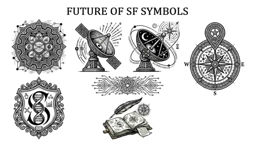
SF Symbols continue evolving rapidly.
Future improvements may include:
- More animations
- 3D effects
- AI-assisted icon suggestions
- Enhanced customization
- Expanded accessibility support
As digital interfaces become more advanced, icon systems will remain essential.
Apple’s investment in SF Symbols shows how seriously the company values user experience and visual communication.
SF Symbols and Modern Design Trends
Modern design focuses heavily on:
- Simplicity
- Clarity
- Accessibility
- Speed
SF Symbols align perfectly with these trends.
Minimalism
Clean icons reduce clutter.
Responsive Design
Symbols adapt smoothly across devices and screen sizes.
User-Centered Interfaces
People can understand actions quickly without reading long instructions.
This makes apps faster and easier to use.
Frequently Asked Questions
1. What does SF in SF Symbols stand for?
SF stands for San Francisco, which is Apple’s system font family.
2. Are SF Symbols free to use?
Yes, SF Symbols are free for designing and developing apps within Apple’s ecosystem.
3. Can Android developers use SF Symbols?
SF Symbols are mainly designed for Apple platforms, though some designers may use similar concepts elsewhere.
4. How many SF Symbols are available?
Apple currently offers thousands of symbols, with new ones added regularly.
5. Do SF Symbols support animation?
Yes, many modern SF Symbols support animations and advanced rendering effects.
Conclusion
SF Symbols have transformed modern app and interface design by providing a clean, flexible, and highly accessible icon system for Apple platforms. From iPhones and Macs to smartwatches and tablets, these symbols improve communication, usability, and visual consistency across digital experiences.
Their importance goes beyond aesthetics. SF Symbols help developers save time, assist users in navigating technology more easily, and support accessibility for millions of people worldwide. Whether you are a beginner exploring app design or an experienced developer building professional software, understanding SF Symbols is an important step toward creating better digital experiences.
As technology continues evolving, SF Symbols will likely remain a core part of Apple’s design ecosystem and modern user interface development.

Clara Miles
Hello! I’m Clara, a lifelong dreamer who finds magic in everyday moments. Writing has always been my way of exploring the world and understanding the people around me. I love creating stories that make readers laugh, cry, and reflect on life’s little surprises. When I’m not writing, you can usually find me sipping coffee at a cozy café or wandering through nature with a notebook in hand. My journey as an author is fueled by curiosity, imagination, and a love for connecting with my readers. Every story I write is a piece of my heart, and I hope it inspires yours too.
Books:
-
Whispers of the Heart
-
Shadows and Sunlight